
Google quietly updates its logo after a decade
Google, one of the most recognized brands in the digital world, has quietly refreshed its logo after a decade. This change emerged with the latest update to the Google app on Android and iOS platforms, standing out as a noticeable difference among users. In the updated logo, Google’s iconic red, yellow, green, and blue colors are now connected through gradient transitions rather than sharp separations. This gives the logo a softer, more modern, and fluid appearance.
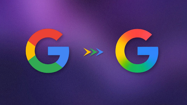
However, the new logo hasn't been rolled out universally yet. The classic “G” logo with sharp color transitions is still visible in browser tab icons and Google’s media kits. Moreover, this design update hasn't been applied to Google’s other mobile apps either, suggesting that the new logo might be undergoing a limited test phase.
The new design appears to be more than just an aesthetic change; it may also reflect an evolution in Google’s overall design philosophy. Similar gradient effects are seen in the logo of its AI assistant Gemini and the AI mode of the Google Search app. These similarities indicate that Google is moving toward a more cohesive visual identity.
What’s most striking is that Google introduced this change without an official announcement. Unlike the extensive introductions that accompanied its major logo redesign in 2015, the company has remained silent this time, creating the impression that it is conducting a preliminary test to observe user behavior. Perhaps Google is taking small steps to gather feedback ahead of a larger rebranding effort.